Modest Beer

Small Pleasures

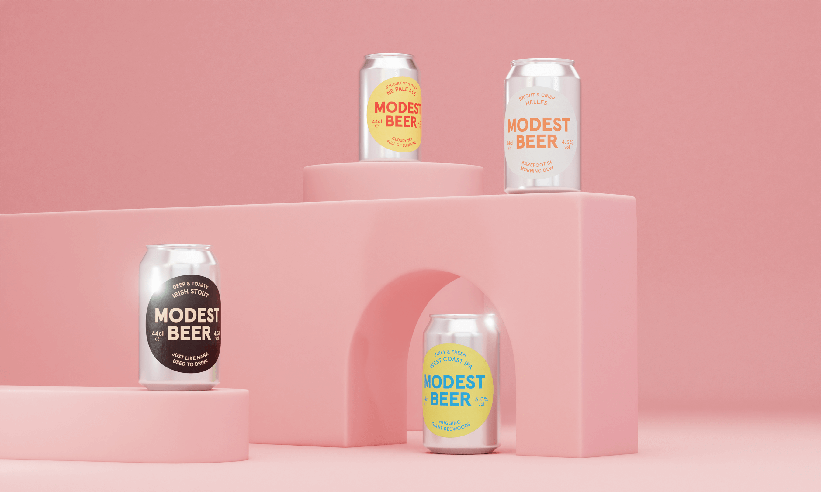
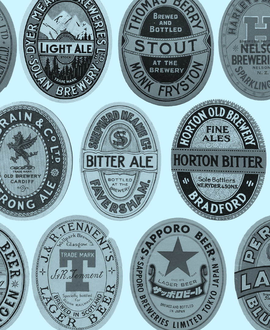
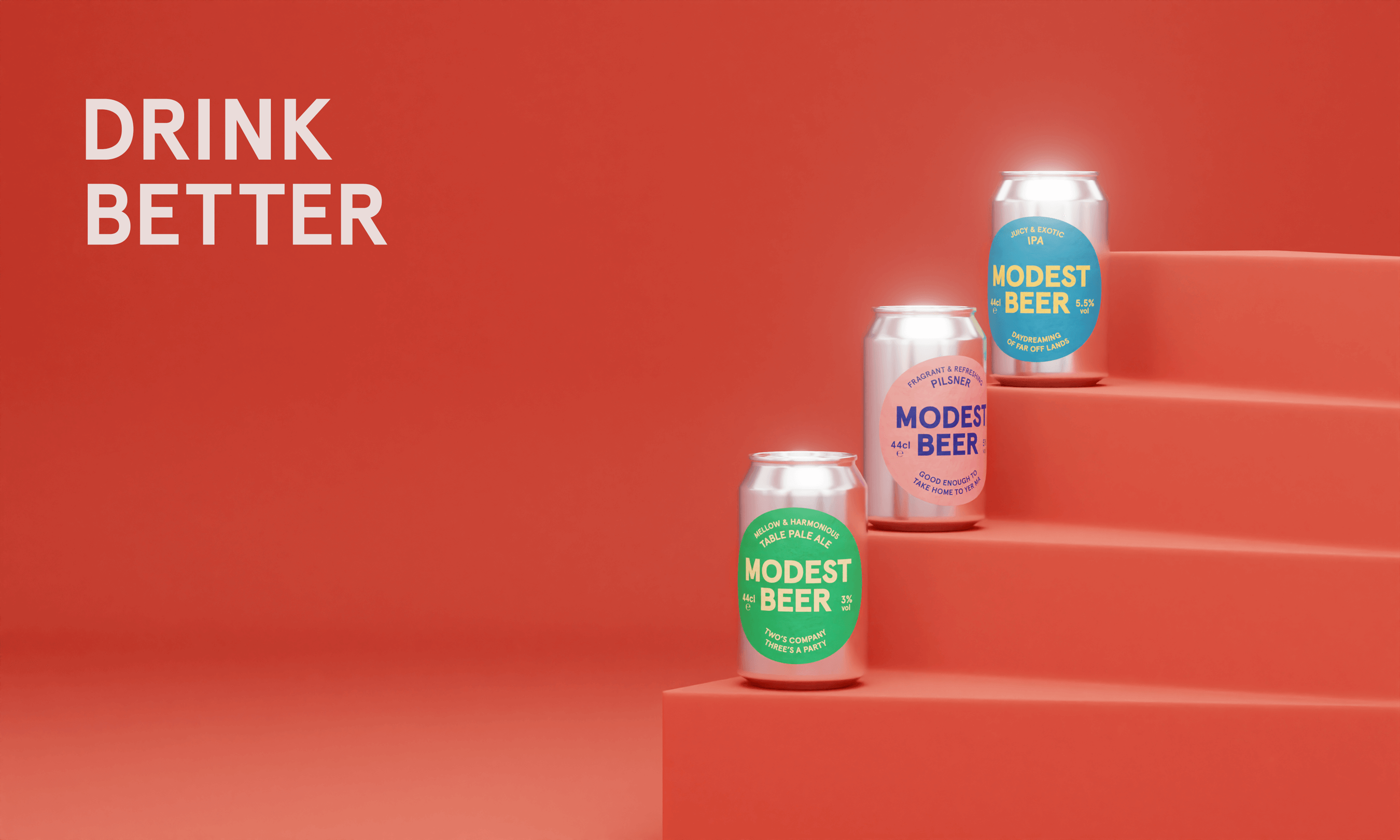
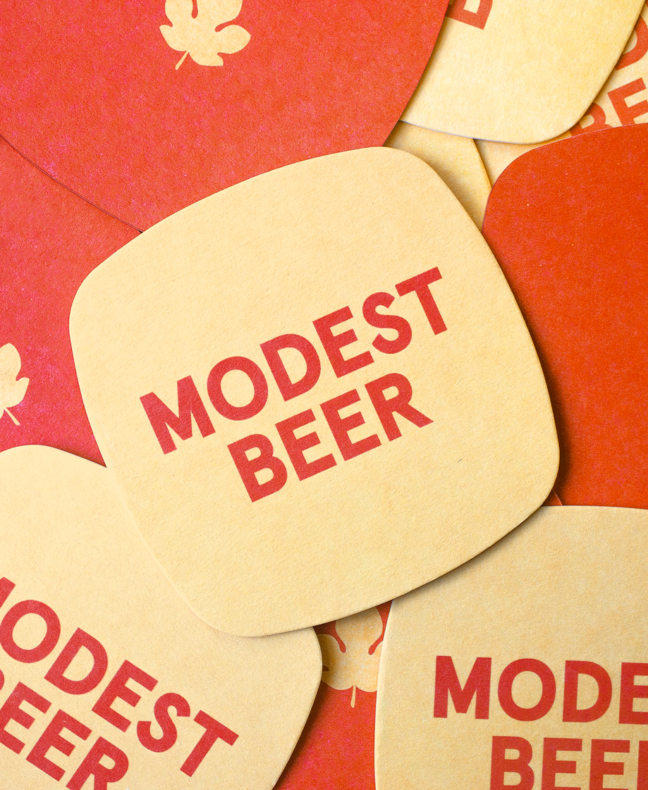
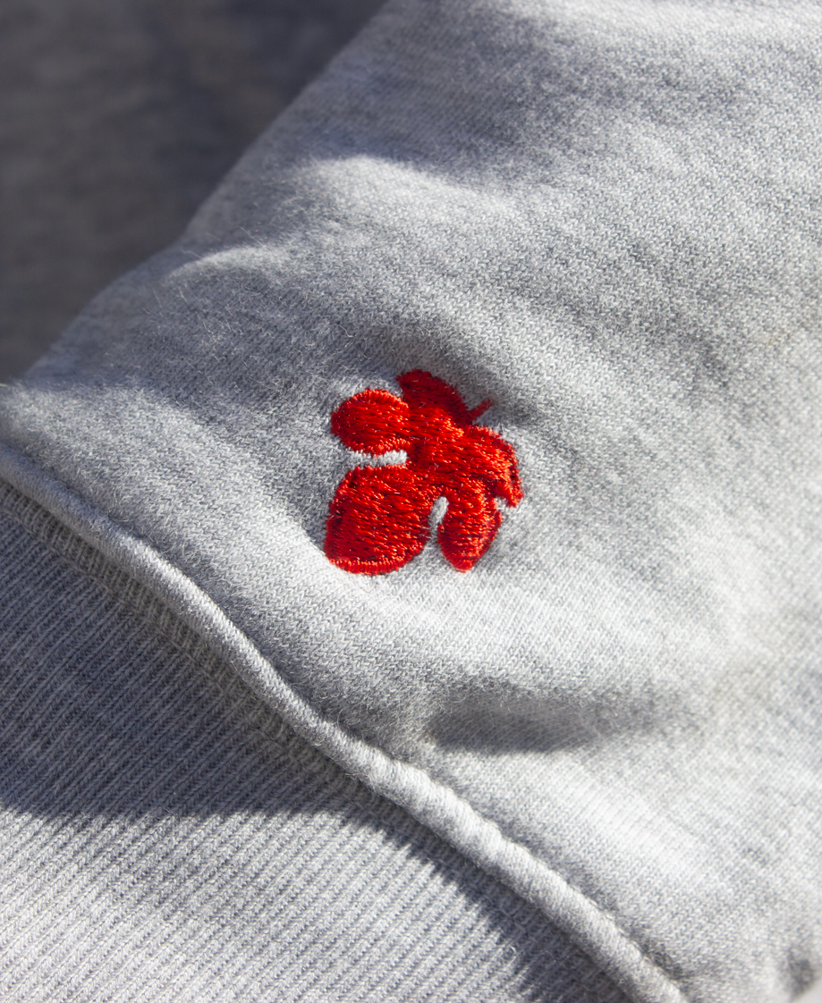
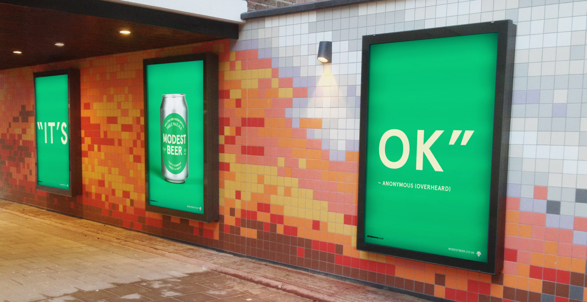
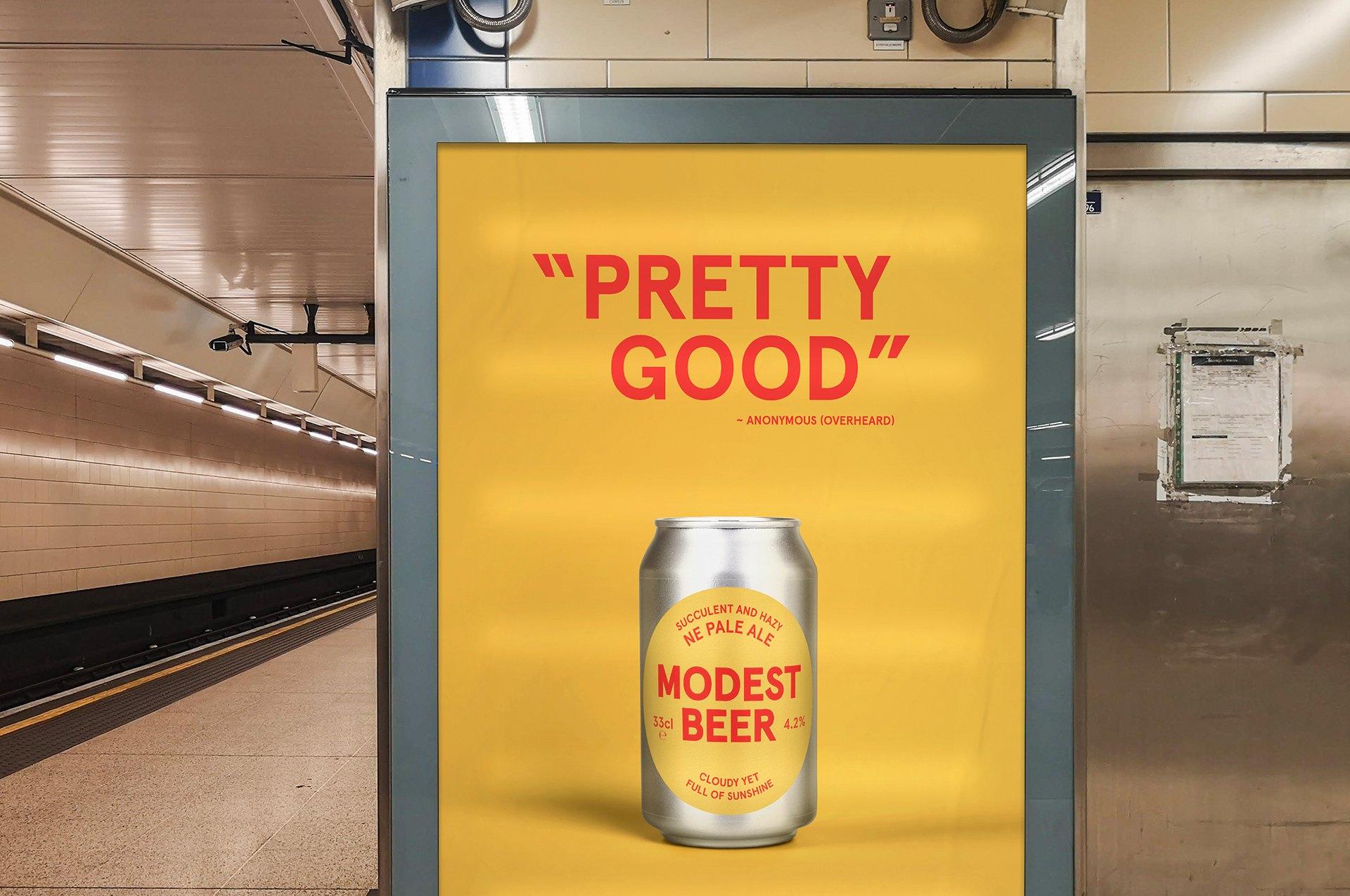
The embodiment of simplicity, Modest Beer is an antidote to the often loud, bombastic, or shallow trends in the craft beer world. A reminder to slow down and relish life’s smaller joys. This idea of humble pleasures is expressed as simple but finely tuned details to make an iconic label system, that’s striking in its plainness.

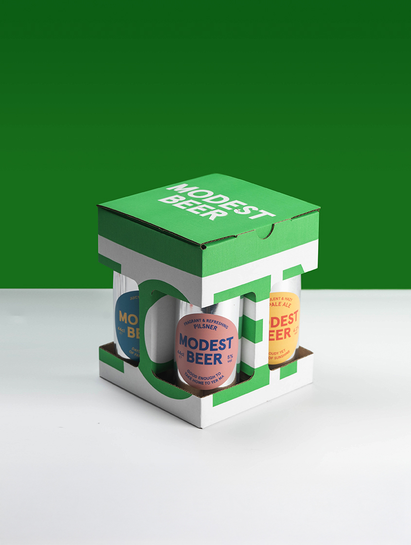
From conception, naming and strategy to all things words and design. We’ve acted as creative partners and a trusted voice from the very start and we’re thrilled to see Modest Beer becoming one of Northern Ireland’s fastest-growing breweries.

Services
  • Strategy
  • Identity
  • Packaging
  • Merchandise
Sector
  • FMCG
The Big Idea

To guide decisions and build a shared ethos, we adopted the motto 'Drink Better. An idea expressed in 2 parts.

1. A statement of intent – to make excellent beer for people who enjoy excellent beer.

2. A reminder – to ignore the noise, jostling, gimmicks, and trends in the market and focus on point 1.

Who gives a fig?

The fig leaf serves as a secondary logo and a shorthand for the ethos behind Modest Beer. Let us explain.

In the past, modesty meant restriction and censorship. Under that pretext, the victorians (among others) vandalised countless works of classical art, adding fig leaves to cover up the wobbliest bits of the natural human form. The fig leaf hence became a symbol of prudish repression. 

But not to us. We see the fig leaf as a reminder to cast off old ideas and appreciate things for what they are, in all their honest glory (no matter how fleshy it might be).

Two Thumbs Up

To build a minimal identity that doesn't sacrifice character, we developed a distinct tone of voice. Wry, sometimes self-deprecating, we've embraced the understatement, albeit with a wink and a smile.