Common Ground

Stick Together
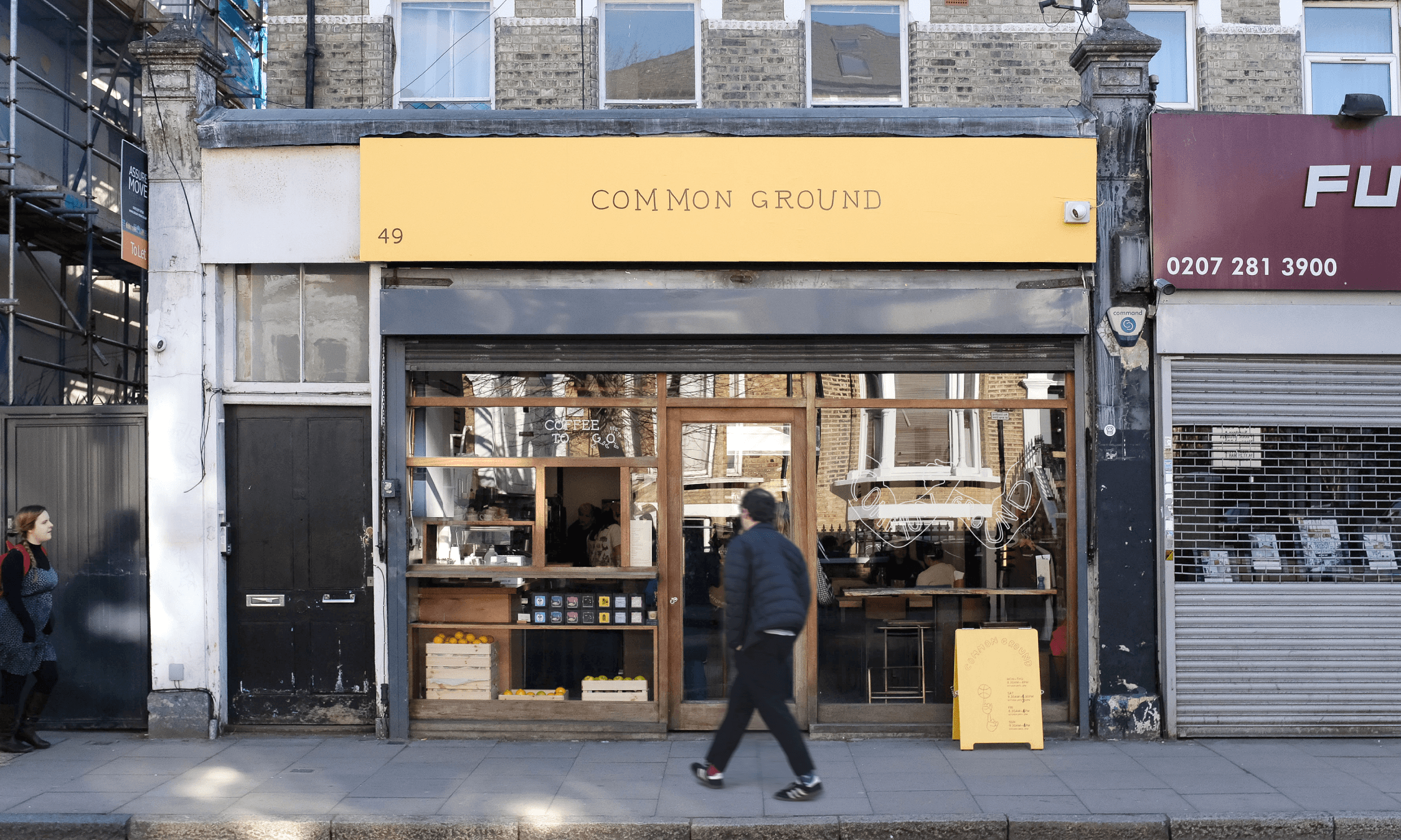
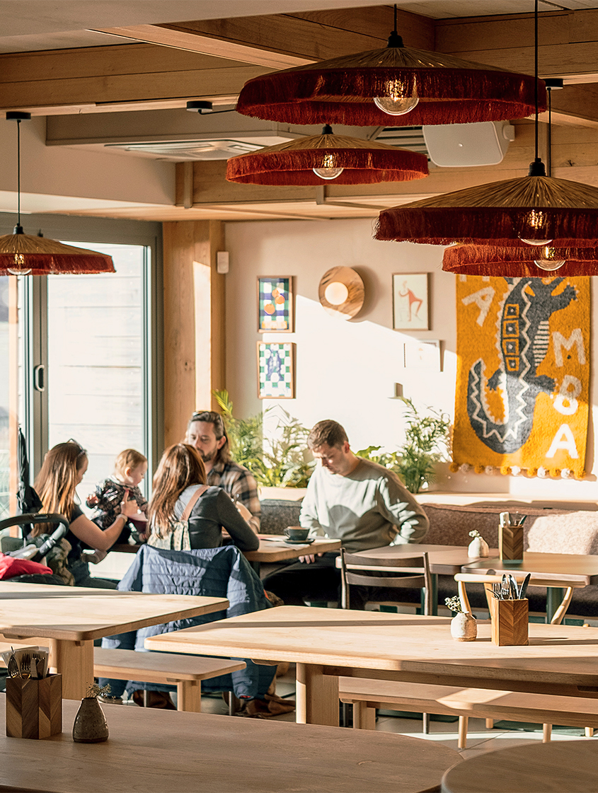
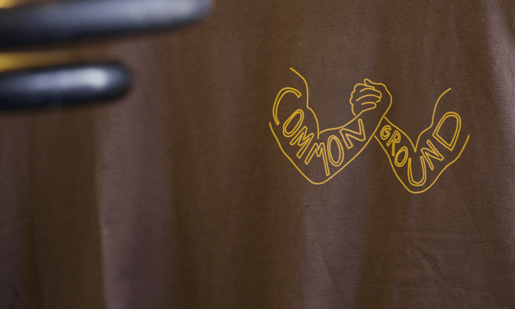
In its nook in Stroud Green, Common Ground has won many a heart. It’s amassed a loyal following and a cult reputation as the slow-down place to gather with good company and dine on food that nourishes the soul. Until now, the brand has been defined primarily by its dynamite dishes, while a visual identity has remained on the periphery. But Common Ground is more than just a dish.
We were brought in to uncover what ignites such deep loyalty and to translate that feeling into a visual language, something we quickly discovered in abundance.
Credit & Thanks

Studio Photography
Tom Collins

Location Photography
Louis James

Signwriting
The Sunny Sign Co

The Entire Brand
The wonderful staff, customers & friends of Common Ground

Services
  • Web Design
  • Strategy
  • Identity
  • Merchandise
Sector
  • Hospitality

Common Ground is a space for, and run by, great people. What the business has become is more than the lifeblood of its founders; the passion of the staff and the devotion of its customers is the true heartbeat of the place. Our aim was simply to hold up a mirror to that energy and give the community a genuine stake in the place they call home².If they are the heart of the business, why shouldn’t they be the face of it? With more than 500 wild logos and crazy illustrations (crazy, an understatement), we crowdsourced everything from the loyal staff and customers who walk through those doors every day. Of course, inviting that many voices comes with its own chaos, so we grounded it all with a simple framework of type and colour to bring cohesion to the madness.

In the pursuit to rope in as many fingerprints as possible, Common Ground has a visual texture that is truly them, whilst also being truly others. This symbiosis is a constant cycle that will allow future iterations of the brand to grow and keep its customers and staff at the forefront of the brand, while the Latke Bennies keep coming.